
Examples of Tutorials in Apps
I recently purchased a bike that has an unusual feature –- instead of the classic chain drive system, it features a carbon-fiber belt that, doesn’t require messy grease, is nearly silent, and won’t rust in the rain. But, because it’s a fairly novel system for a bike, I had no idea how to properly set it up. Luckily, there was an app to help with that task, and it centers around a fairly unique interaction: you pluck the carbon-fiber belt on the bike as if it were a guitar string, and the app measures the sound’s frequency with the microphone in your mobile device to tell you whether the belt is properly tensioned. Neat!
When I first launched the app, it ushered me into a long tutorial on how to set up the new belt. The multistep tutorial was nice and clear, except for one big thing –- once I finished it, I couldn’t remember how to do the procedure on the setup screen, and, even worse, I couldn’t figure out how to launch the tutorial again. Eventually, I realized that there was a list of instructions available in the Help menu, but that still required me to memorize the steps, go back to the main part of the app, and complete the process with all that information in my working memory.
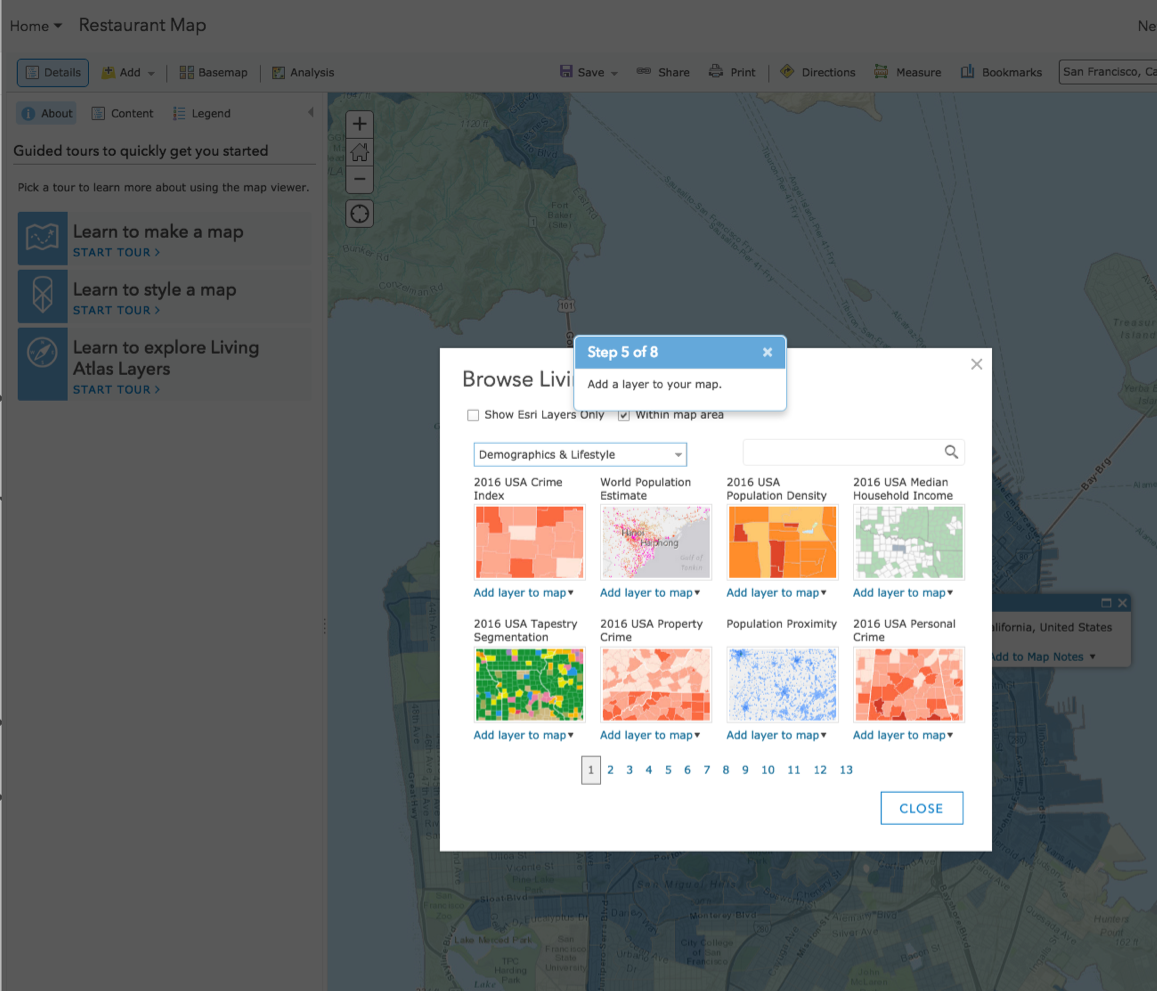
Consider another recent experience. I was trying to dispute a fraudulent credit-card charge in my bank’s mobile app. I was, as you might imagine, a bit stressed. As I logged into the app, hoping to get things resolved quickly, I was bombarded with this walkthrough:

Now, I’m happy for the Chase UX team that it’s made improvements. However, I was not filled with a sense of excitement and wonder when I encountered this tutorial. Nor was I motivated to go and explore these changes; I had a task to complete, and it was fairly pressing. This tutorial added to my stress during a moment when I relied on my bank to provide ease and stability. In that context, the happy and excited tone of the messaging came across as rather tone-deaf –– it also slowed me down, which is something that we don’t often want to do to our users.
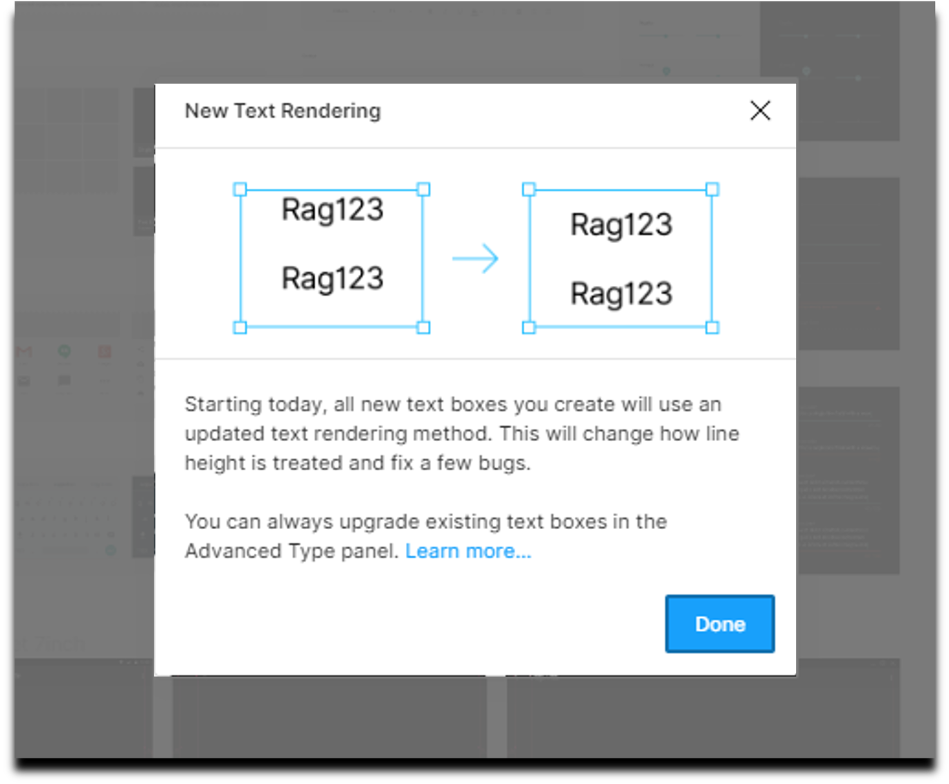
Or, consider another variation of this common experience. Imagine you’re on a tight deadline to finish a project at work. You log in to the productivity application you use everyday and are bombarded by a list of changes in a What’s New release-notes modal. You dismiss it without bothering to read it, trying to get to your work. You then realize that many of the tools and features you rely on have been moved around, but you can’t find that list of changes anywhere to guide you
Tutorials: Disruptive, Often Skipped, and Easily Forgotten
Good help and documentation are critical, especially with fairly complex or nonstandard interactions. And, in fact, this is one of the 10 usability heuristics.
But not all help is created equal. Intrusive tutorials and lists of changes that are shown when an app is launched or at random points during the user’s session are a type of push revelation. Push revelations reveal new information out of context, without any specific indication that the user would benefit from the information at that moment. A good user experience depends heavily on context –- presenting information and options to users at the right moment, when they are ready for it, not when it’s convenient for the system. Push revelations are well-named: they are typically pushy, devoid of context, and intrusive.
These sorts of tutorials tend to get used in two ways: for new user onboarding and to make existing users aware of new features or changes. Both struggle with similar problems: they interrupt users who are attempting to do something else at that moment, they don’t tend to be memorable, and they also don’t result in better task performance. So, in essence, they slow users down, get in the way, and don’t achieve their very reason for being.
Now, this isn’t to say that walkthrough-style tutorials are never appropriate (our own research indicated that they were useful for onboarding new users to a novel interaction paradigm like AR), but they are dramatically overused. Moreover, we find that users frequently skip them.
Tutorials seem like they should be effective for helping users learn: they’re directly telling users how to use the software! And yet, in our studies, they frequently don’t perform well with real users. So, what goes wrong? Is the whole idea of a tutorial bad, or is the execution that’s flawed? Are there ways to make them work better?
First, let’s break down what’s wrong.
Why Tutorials (and Push Revelations) Don’t Work
These are the main design mistakes that tutorials (and, more generally, push revelations) make:
- Users want to start using the product right away. They don’t want to spend time studying how to use your app.. This is known as the paradox of the active user (a paradox because the prep work would benefit them in the long run). The interruption posed by a tutorial is unwanted, so users skip it.
- The guidance that tutorials provide, while potentially helpful, is hard to remember when the user needs it. The tutorial shows information out of context, and users would have to memorize it to use it when applicable. Unfortunately, our memory is quite limited. Tutorials could increase the likelihood that users retain the information by forcing them to practice using the feature. However, that can be annoying for those users who turned to the product to complete a different task.
- Dismissing the tutorial or the push revelation requires user effort. For example, push revelations (even if not full-blown tutorials) are often designed to be visually salient and noticeable, which unfortunately also makes them more likely to be distracting or annoying.
What Works: Pull Revelations
It turns out that we can solve these issues by presenting help content contextually. Pull revelations are help content triggered by some signal that the user would benefit from that information at that moment. Pull revelations can come in a variety of formats ranging from hover tooltips or coach marks to more expansive patterns like step-by-step task-flow wizards.
Guidelines for Implementing Pull Revelations
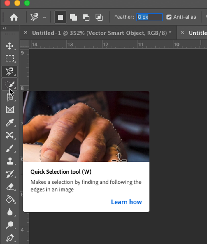
Pull revelations require that the app knows the what the user is trying to do and thus, they can be trickier to implement than push revelations. Determining the user’s goal is relatively straightforward in some situations — for example, if the user hovers over a new toolbar icon, it’s appropriate to show them a tooltip or an instructional overlay.
However, for more complex work, things can go wrong. The famous Clippy, the Microsoft Office assistant, was a failed attempt to develop AI-driven pull revelations; the failure was due to the intrusive and didactic nature of the revelations, the annoying animated, hard-to-ignore character sitting in the user’s peripheral vision, and the relatively unsophisticated, often wrong pattern matching used to figure out what the user was attempting to do.
Some guidelines for appropriately using contextual help include:
- Make it easy to dismiss (and recall) the help content. Being able to get rid of a (momentarily) unhelpful overlay is absolutely critical, but so is the ability to find this information again later, when it is actually useful.

- Use progressive disclosure in the help content. Make the existence of the contextual help visible, but do not overwhelm the user with detail until they ask for it.
- No memorization! For multistep workflows, make sure that the help content doesn’t require the user to keep lots of information in their working memory — show help content alongside each step to minimize cognitive load.
- Skip the obvious stuff. If your app follows design conventions, you probably don’t need to give users lots of detail on what the gear icon means (it usually means Settings). Save the contextual help for more complex functionality or processes.
- Understand the user’s journey to that feature. Take the time to really consider when the user is most likely to interact with the feature in question. This is the most important guideline, but also the most complex. This requires user research and task analysis to figure out how users actually interact with your product and what sorts of signals indicate that a user is in need of help.


