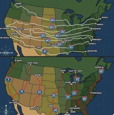
U.S. Interstates visual
How did I not know this before?
Even number interstates: Side to Side
Odd number interstate roads: Up and Down
I love it when a simple graphic like this teaches …
Data doesn’t have to be presented in dull charts and graphs. These Swipes take data and present it in a fun way!
How did I not know this before?
Even number interstates: Side to Side
Odd number interstate roads: Up and Down
I love it when a simple graphic like this teaches …
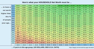
While this chart isn’t visually very interesting, but the content is very juicy!
This is USA data from 2023 that shows your age and net worth, and what percentage you …
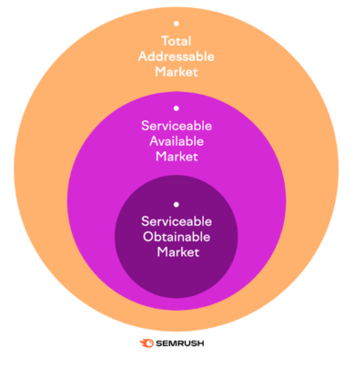
When looking at market size it’s helpful to look at the realistic amount you can capture.
TAM: Total demand for a specific product/service in a market.
SAM: Portion of TAM …
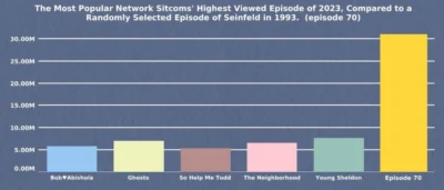
In 2023 you’d have to combine the top 5 highest viewed episodes of television shows, just to equal just one mid-sized episode of Seinfeld 😮
This random episode they are …
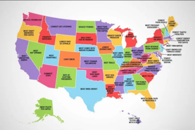
This is a fun graphic with something that each state has the most of.
I’m from Texas: We apparently have a lot of wind energy!
Also this is the kind …
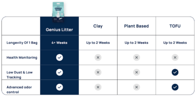
A simple comparison chart can make-or-break someone’s decision to buy. Here’s a great one from Ramon Vanmeer’s company Genius Litter (which was recently on Shark Tank). …
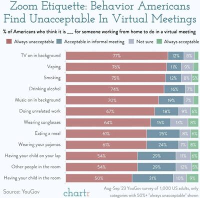
If someone hits a vape during a call I don’t think I’d mind that much 😂
Music in the background? Well that’s just rude.…
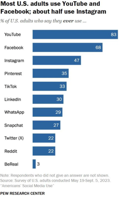
YouTube is the widest used social platform…
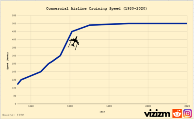
Average cruising speed of commercial aircraft leveled out at ~500mph and has stayed there for 45 years.…
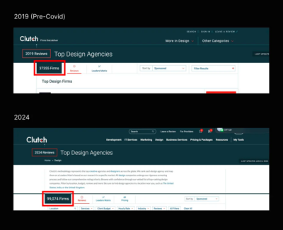
Wow…since 2019 there are 60,000 more design agencies listed on Clutch 🤯
Likely caused by:
– More solopreneurs entering the game.
– Remote work makes this more possible.
– Starting …
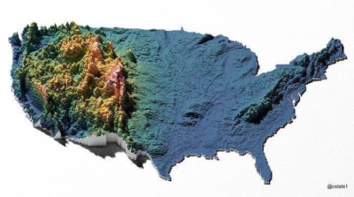
I never realized what a monopoly on mountains the West had till I saw this color coded topographical map!
Almost always I’m seeing maps like this which don’t convey much …
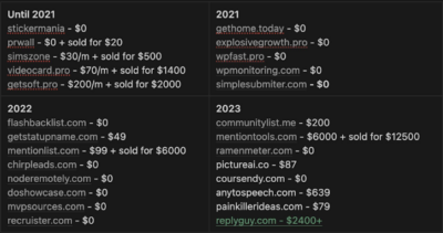
Guy builds 20+ tools over 4 years before finding one that’s starting to work.
Lesson #1: Try lots of stuff. Pivot quick. Act fast.
Lesson #2: The real winner here …

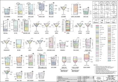
This incredibly detailed image instruction set gives the full instructions on how to make ~40 drinks. It’s kind of cool how much data is easy visualized in this one image.…
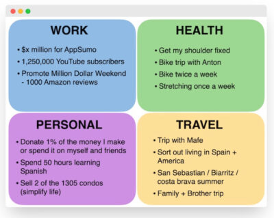
This is a cool Yearly Goal Chart @noahkagan makes every year, divided into 4 parts:
– Work
– Health
– Personal
– Travel
Each section limited to 4 goals or …
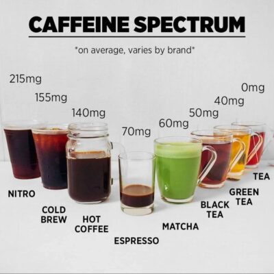
Easily visualize the caffeine content you’re getting from different drinks with this cool graphic.
This is generalized data, actual content can greatly vary.…

The “Normal Distribution” shows up in almost every area of life:
• Test scores
• Height
• Stock market returns
• Intelligence
• Attractiveness
It also shows up in your …

The world’s top podcasts. Interesting that each one is from a specific individual.…
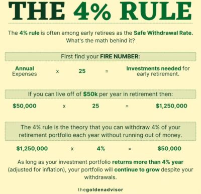
“The 4% Rule is a “back-of-the-envelope” calculation for how much money you’d need to retire for approximately 25 years.
While people can poke holes in generalized rules like this, it’s …
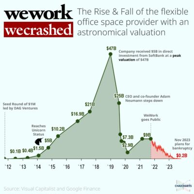
While I understand over zealous management killed off WeWork, I am a bit saddened by this because I had WeWork offices all over the place and loved them.
Of alllll …