Quick-fix checklist to improve signup form conversion

Product-led growth (PLG) is all about that first signup: the moment when someone creates an account to get into your product.
If your signup rate is lower than you'd like, your marketing may be attracting the wrong people … or it's attracting the right people but the signup experience itself isn't working.
Guillaume "G" Cabane and Martin "Gonto" Gontovnikas run HyperGrowth Partners, an advisory that specializes in scaling PLG businesses — and they know the ins and outs of fixing signup and form conversion.
Take your signup forms through their checklist of quick-fix tips for conversion optimization. Pick those low-hanging lemons!
G and Gonto walks you through all their tips in this 50-minute on-demand video, complete with teardowns of real PLG landing and signup pages.
1. Match the CTA wording on the same page
Let's start with an easy one. If your above-the-fold CTA says "Get Started," your CTA at the bottom of the page should say "Get Started" too. If it says "Sign up," use "Sign up" later too.
2. Don't make people click a button before entering an email
Ask for a work email address right next to a "Sign up" button (or "Get Started" button, or what-have-you).
There's no need for your form design to force an extra click just to take your visitor to a second page or popup for the form. Breaking down a signup flow into multiple steps can add friction — and if you do, there's little reason to do so before you capture the email address.
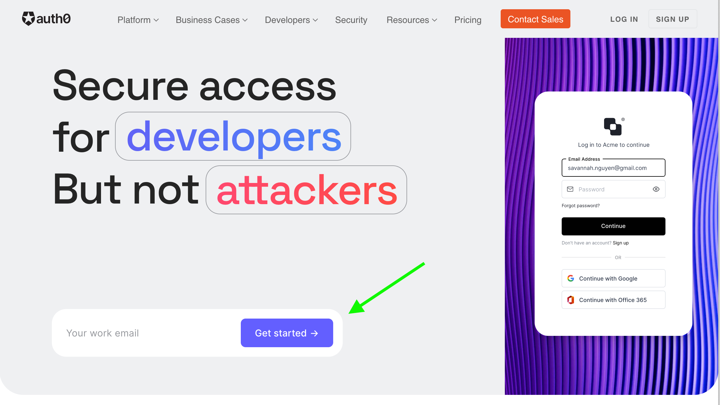 Good example of getting the email with, not after, the button click
Consider it this way: every additional step in a form is a drop-off risk, and according to G and Gonto, a cost of 30% from your optimal conversion rate.
3. Use Google One Tap for one-click signups
What about an even easier signup process? If you're going after qualified B2B leads, chances are they're using a Google account for work. Try putting the Google One Tap signup option upfront so that one click is all that's needed if you're already logged in. (A quick summary of the feature.)
Here's an example from Slab:
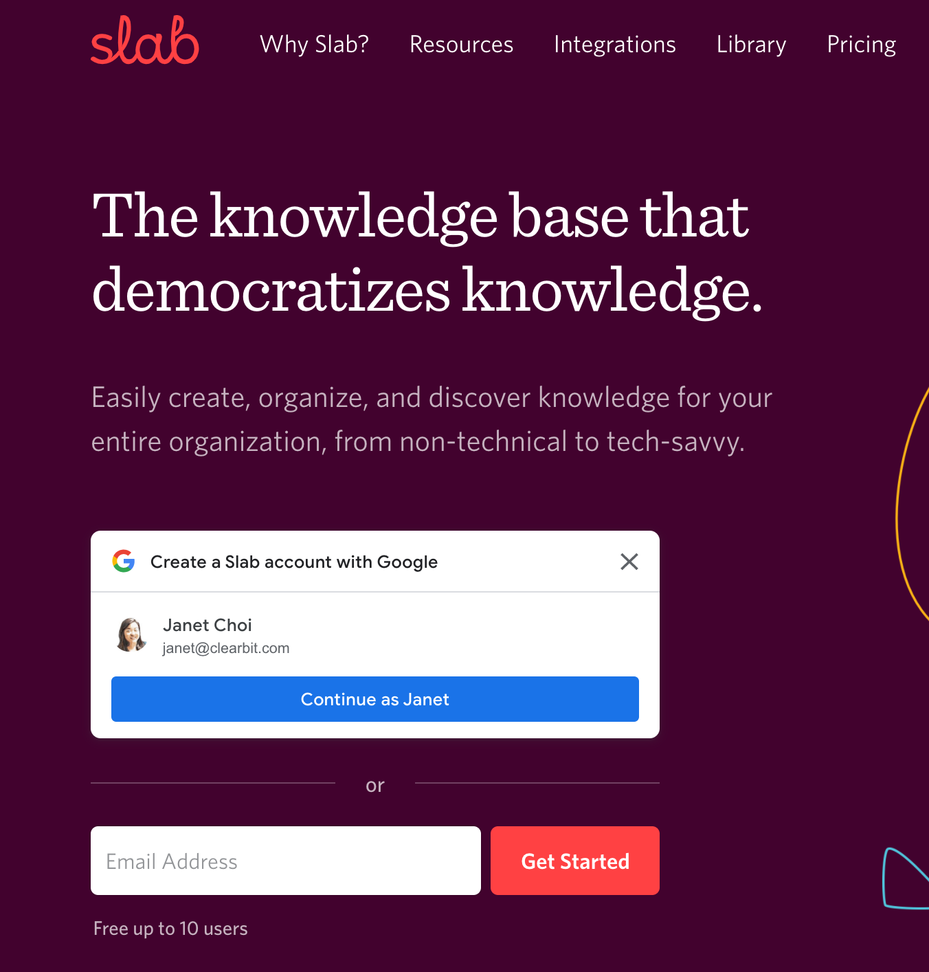
Slab shows me the option to continue with the Google account I'm already logged into for work. When I click the big blue button, "Continue as Janet," I'm all signed up for the product. It's a great user experience.
As G points out, "just let the people use the Google account to sign up from your homepage and save three clicks." Given the drop-off risk, that could mean saving 70% of signups from leaking away.
And for anyone who is not on a Google account or prefers not to use the Google system, there's still the quick and easy option to fill in your email address to get started.
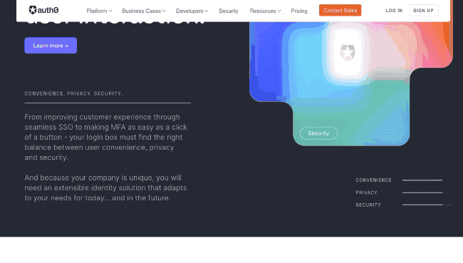
4. Put customer logos above the fold
Don't hide the good stuff! Put social proof like logos and testimonials up top.
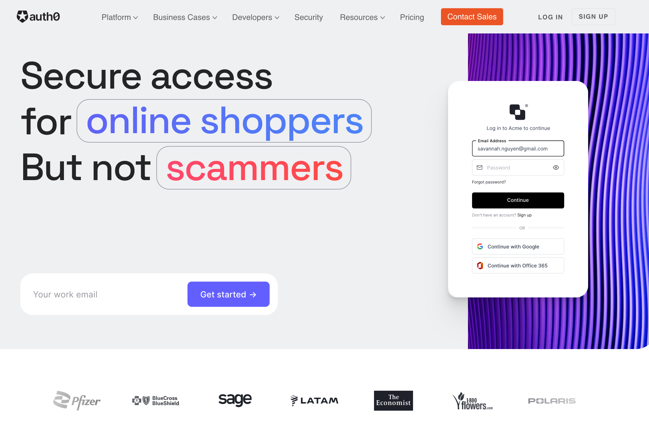 Customer logos scroll above the fold on Auth0's homepage
You can use Clearbit Reveal, paired with a website personalization tool, to customize the logos you show to different visitor segments (for example, industry, enterprise vs. B2B, and so on), even before they've filled out any forms. For example, Docsend used Reveal and Mutiny to customize logos for enterprise customers and saw a 260% conversion lift.
5. If you ask for a phone number, call it back within five minutes
If your form has phone number as a required field, you better be calling your lead's number within five minutes. As Gonto says, then "the experience is fantastic." If you're not — or you just can't — remove that field altogether.
6. In fact, follow the five-minute rule for every form field
In designing your signup form and the number of fields, ask yourself whether you'll really be using that info within five minutes. Will it be leveraged on a sales call, within the dashboard, or during the onboarding experience for the customer experience, or in key workflows like lead scoring and routing on the internal side of the house?
You can cut anything else.
You can use Clearbit Forms to automatically enrich signups with Clearbit data and pare down the number of required form fields. So when you're going after qualified B2B users, all you really need is a field asking for their work email address. Clearbit will supply their name, title, company name, work domain, and more.
7. Put your entire form above the fold. No scrolling!
If you do need to ask for more information — like, for a sales contact form, for example — make sure your design allows your entire form to fit above the fold. No one should ever need to scroll to get to the "Submit" button — or as G so succinctly puts it: "Scrolling on a form is like heresy."
8. Make your pages shorter and more value packed—because people don't scroll
Continuing the scrolling theme … you can lose as many as 20%–30% of your leads on the second or third fold if you don't provide enough value there. People just don't like to scroll. If you force them to, your page must tell a story, flowing smoothly from top to bottom.
You can use a tool like FullStory or Hotjar to watch recordings of users not having fun as they scroll — and get lost — on your site.
9. Highlight integrations above the fold if they're a key part of your business
For many B2B buyers, integrations are a major value prop. Put the logos of the tools you integrate with high up on your page. This isn't just supporting information — it's extremely valuable.
If you have lots of integrations, think about creating a scrolling header to show how many there are, without requiring the visitor to click on them to find out.
10. Put success stats high up, too
Sensing a theme here yet? All the important info goes above the fold — including what your product delivers. If you have success stats like ROI on your page, make sure they're not buried and highlight them by your value prop copy, right above the fold.
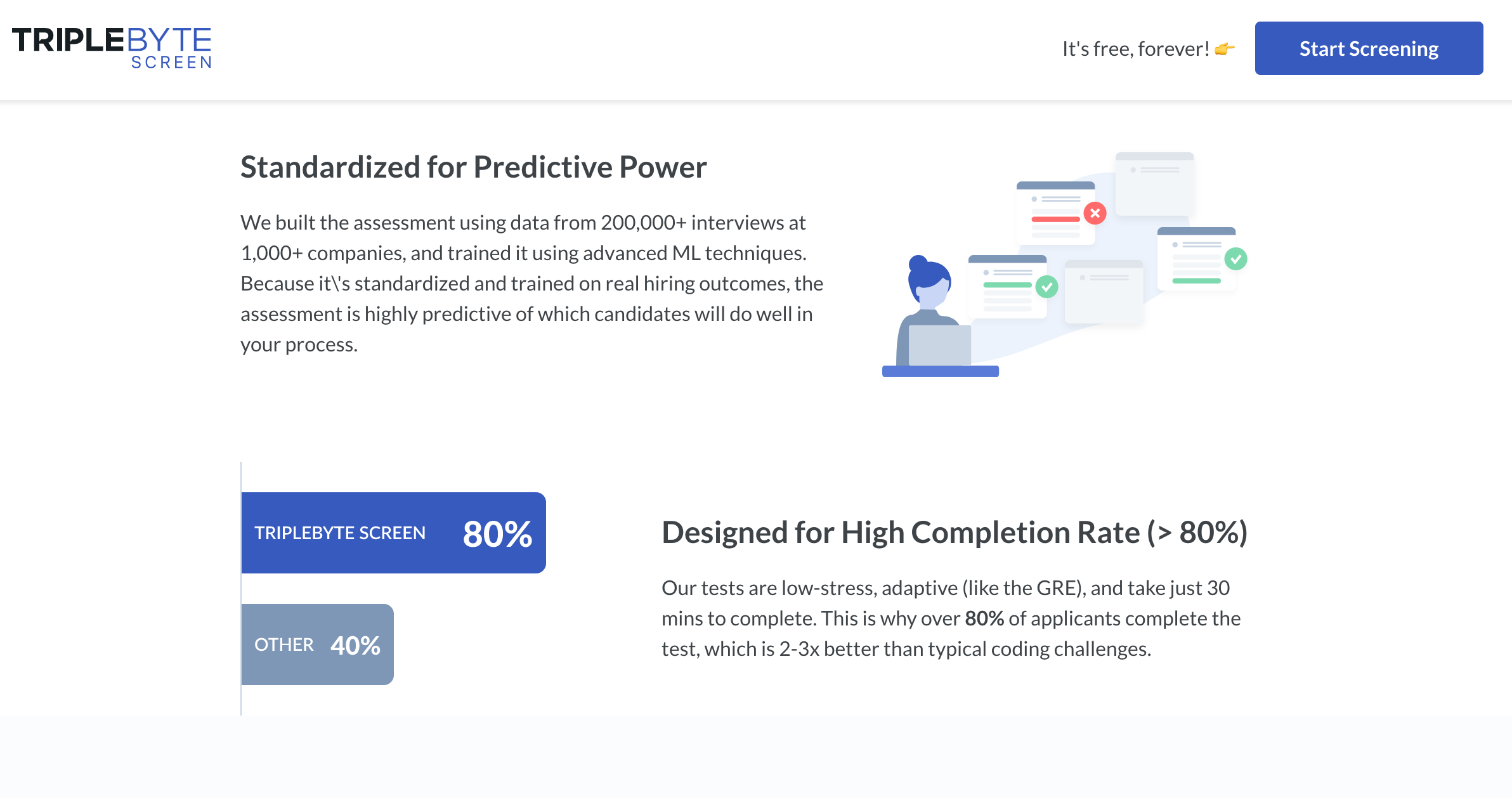 ROI section from Triplebyte landing page
11. Make sure there's always a CTA button available as the user is scrolling
If you have a moving sticky navigation that follows a visitor down the page as they scroll, make sure you have a CTA link on it, so the visitor can click and move forward at any time.
That's all there is to it! In sum, move all vital information up above the fold, have consistency between your CTAs, remove form fields that you're not going to use within 5 minutes, and make signing up easy so you can increase conversion and save creating friction for a good reason — like asking for qualitative, value-add information such as what use-cases people are most interested in.
G and Gonto walk you through all their tips in this 50-minute on-demand video, complete with teardowns of real landing and signup pages.
