


Modern typefaces can be tricky to identify.
If you’re new to the world of typography, you may not be aware of some of the more arcane aspects of it. There’s a whole discipline dedicated to the intricacies, lineage, and artistry of typefaces that goes beyond basic concepts like the difference between a serif and sans serif typeface. You’ll need to dig a bit deeper into the complexities of modern fonts and typefaces to recognize ligatures or subtle nuances, such as why a particular typeface is considered art deco. Recognizing these nuances can help you as a designer to use them meaningfully in your web design.
Reader's note: While we’ll be using the terms ‘font’ and ‘typeface’ interchangeably at times throughout the article, note that the two terms are not synonymous. ‘Typeface’ describes a particular style in lettering (also known as ‘font family’), whereas ‘font’ describes the variations in weight (and size) of the typeface.

A brief history of modern fonts
When discussing modern fonts, it’s important to take a look at what came before them.
Serif fonts
Commonly used in print media (e.g., books and newspapers), serif fonts are typefaces with rounded strokes (or lines) and decorative ends on each character – the character being the letter, number, or punctuation mark.
There are 3 main styles for serif typefaces: humanist, transitional, and slab.
1. Humanist serif

Humanist serif, also referred to as ‘Old Style,’ is a serif typeface done by hand, known for its natural characteristics. This style of serif font emulates classical calligraphy with its slanted vertical axis and low contrast strokes.
The round shapes and flowing form create a handwritten look — the appeal of this serif font is undoubtedly its organic and fluid style.
2. Transitional serif

Transitional serifs have sharper, more distinct, or contrasting strokes that define their distinguishing style. Widely used serifs such as Times New Roman, Georgia, New York, or Cambria may come to mind; these fonts are favored by printers and publishers.
Modern typefaces are the descendants of these transitional serifs, the differentiator being a more distinct vertical stress than their predecessors. They also have gently sloped serifs that mimic calligraphy.
3. Slab serif

To the untrained eye, it’s hard to discern between the slab serifs and modern typefaces because they both have vertical stress and thin serifs. Slab serifs differ in one major way — they do not have a noticeable difference in stroke weights.
Popular serifs like Courier, Bondi Egyptian, and Rockwell may come to mind; however, these slab serifs aren’t categorized as modern typefaces, despite being extremely popular across the web.
While they may not officially fall into the modern fonts category, they’re closely related, meaning they might be the look your client wants when they say, “Make it modern.”
The evolution of modern typefaces
Modern typefaces are sometimes referred to as Didone or Neoclassical. Though the term “modern typeface” may bring to mind futuristic fonts or a minimalist font like Helvetica, neither is considered a modern typeface in the ‘traditional sense’ of graphic design.
Typographers formally define a modern typeface by tracing its roots back to the 18th century. These typefaces exist thanks to the evolution of printing processes. Gone are the blotchy serifs of the transitional fonts — more advanced printing technology makes crisp lines and delicate features possible.
This family of modern fonts shares common DNA with each other and have distinct traits that set them apart from other categories of typography. Once you know what to look for, you’ll be able to spot a modern typeface easily.
Modern serif fonts
Modern serif fonts are marked by different weights between strokes and have thin unbracketed serifs. They exhibit vertical stress within their letterforms, meaning that each glyph stands straight up without any sort of horizontal tilting.
They’re also marked by ball-end terminals at the end of some letters, most notably on lowercase “r” — though it’s not unheard of to see these circular elements on uppercase letters as well.

Sans serif fonts
Sans serif typefaces are defined by their lack of serif within the stroke of a character — hence the use of the French word ‘sans,’ meaning ‘without.’ This dropping of the decorative strokes, lines, and ends found within the characters of a serif typeface is exactly why sans serif typefaces (and fonts) are generally considered modern. Due to these ‘contemporary’ design aesthetics, these modern fonts feel clean, minimal, and balanced.

Oftentimes, sans serif typefaces and fonts are considered more accessible in legibility and readability to readers — think of popular sans serif fonts like Arial, Helvetica, Avenir, Calibri, and Open Sans. Their comparatively wide, balanced weight and lack of serif eliminate any visual noise from the reader’s eye, allowing the reader to focus solely on the words, and, more importantly, the message.
Further, modern serif fonts and sans serif fonts, when used alongside each other in design, particularly in graphic or web design, pair wonderfully together. The differing strokes between the two modern fonts create a visual balance and aesthetic ideal for digital media.
How to use modern fonts
With dramatic differences in stroke weights, modern typefaces look best at larger sizes. Designers often use them as display fonts as well as in headers and subheaders.
Modern typefaces generally don’t work as body text. Their spindly features get lost at smaller scales, with their bolder stroke weights overpowering their more subtle nuances.
Modern fonts to use in your own web designs
For designers looking for an elegant font, modern typefaces offer a bit of class with their refined geometric letterforms. Here are a few modern web typefaces to consider for your next web design project.
1. Bodoni Moda
Any discussion about modern typography should include mention of Giambattista Bodoni, whose namesake Bodoni typeface was created in 1798. This typeface is classified as a transitional one, but many consider it the missing link between transitional and modern fonts with its distinct thick and thin stroke weights. There are a number of different styles out there built upon its classic typographic template.
Bodoni Moda is a modern stylization of this classic typeface available on Google Fonts. It has all of the hallmarks of a modern typeface with its thin serifs, ball-end terminals, and sturdy vertical stress. We love Bodoni Moda for its traditional print feel combined with contemporary stylization.

2. Abril Fatface
There’s quite a bit of variety in modern typefaces, and Abril Fatface is a great example of this. It offers heavier letterforms and a dramatic contrast in stroke weights. If you’re looking for a typeface that’s a bit more bold, Abril Fatface is among the best modern fonts out there. As with other modern typefaces, it offers maximum legibility at larger sizes.

Designer’s note: Abril Fatface’s defining thick, heavy strokes evoke a youthfulness that is bold and weighted in design. This modern font is fun, loud, and beautiful, notably in print design.
3. Prata
With its above-mentioned serifs adorned with sharp triangles and its more relaxed curvaceous letterforms, Prata offers a nice push and pull in its lettering.
Its strong stylization makes Prata best suited as a display typeface or at other large sizes where viewers can appreciate its nuances. Prata is one of the best free modern fonts available, making it popular amongst web designers.

Designer’s note: Prata, like Bondi Moda, is a modern font that’s great for print and web design. It pairs beautifully with a sans serif as the primary typeface.
4. Kepler
For design projects requiring a more traditional print feel, Kepler is a great choice. Kepler is available in several different styles and weights, so you’ll have plenty of typographic options.

Designer’s note: Kepler’s differing weights and styles provide a variety of designs, making it an ideal font to use in minimalistic designs, websites, or blogs.
5. Cantata One
Cantata One is another eye-catching modern typeface, whose intricacies work best when you use it in bigger sizes.
This modern font has drastic contrast in stroke weights, particularly in the letter ‘y.’ There’s also a nod to calligraphy with its wonderfully globby terminal ends.

Designer’s note: Cantata One’s subtle stylistic nuances give it the perfect balance and weight for print or online publications, be it a blog, magazine, or journalism. The contrast between the strokes makes it the ideal font for page or article headers.
Use Webflow's visual development platform to build completely custom, production-ready websites — or high-fidelity prototypes — without writing a line of code.
Use Webflow's visual development platform to build completely custom, production-ready websites — or high-fidelity prototypes — without writing a line of code.
6. Vidaloka
Vidaloka is another font best to use at larger sizes due to its distinct stroke weights that get lost at smaller scales.
With gradually sloped terminals and swirled drops, this modern font is both traditional and highly stylized, making it great for web or logo design.

Designer’s note: The larger size and scale in the strokes of this modern font give it a look that’s seemingly ideal for journalism, digital and print alike.
7. Old Standard TT
Old Standard TT is another modernist typeface that projects the feel of print from a bygone era. With a subtle contrast in stroke weights and gentle stylization, Old Standard TT works well for design projects where you want a subtle retro feel.

Designer’s note: Like Vidaloka, Old Standard is also a modern font ideal for digital or print journalism. Further, the crisp look and feel of the font are pleasant to the eye.
8. Ratio Modern
Drawing from Ratio, which was introduced in 1923, Ratio Modern can look quite different depending on which version you use. Stroke weight becomes more pronounced at heavier weights, making these variations better at large sizes. At smaller scales, it takes on a more neutral feel, allowing it to be paired well with other typefaces.

Designer’s note: Ratio Modern is perhaps the perfect modern serif font for web design. The variety of weights allows it to be paired well with just about any sans serif, and the typeface at its heaviest is bold and magnetic.
9. ITC Lubalin Graph
ITC Lubalin Graph is an offshoot of ITC Avant Garde Gothic. It has a bit of a compressed feel, with letters almost right up against each other. As you can see, this font has uniform stroke weights with thin serifs that mimic what’s found in modern typefaces.

Designer’s note: The compressed, gothic aesthetic of ITC Lubalin Graph makes it great as a secondary typeface, or typeface for highly stylized, concept brands.
10. Bodoni Egyptian
We’ve already discussed the significance of Bodoni and showed you a modern spin on this font. Bodoni is also available as a slab serif, in the form of Bodoni Egyptian.
Where Bodoni Moda had a distinct delineation in stroke weight, Bodoni Egyptian offers uniformity. Slab serifs can sometimes feel a bit heavy-handed, but Bodoni Egyptian offers a similar sense of lightness as modern typefaces.
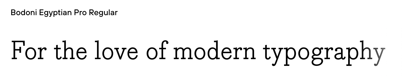
Designer’s note: The added curvature of Bodoni Egyptian give it an added flare. This modern font is versatile — perfect for any medium and ideal for just about any brand.
11. Amasis
Where slab serifs tend to emphasize stronger geometric forms, Amasis adds a dash of humanism. Font styles considered humanist have a bit more looseness in their lettering. Amasis combines aspects of slab serifs and humanist fonts to create a typeface that looks great even at smaller sizes.

Designer’s note: The humanist aspects of this modern font give it an added distinction in comparison to your general serif font. Amasis fairs well on headers and titles alike.
Modern typefaces help bring distinction to web designs
We love modern typefaces for their classy and regal sensibilities. For web designers looking to polish up their work with a bit of sophistication, there are a variety of modern typefaces out there, with many available as free fonts.
For those inspired to learn even more about typography and how it relates to web design, check out this reading list we put together.


