In the last few years we’ve seen the rise of virtual queues — online tools that manage the experience of waiting in line, whether for a digital interaction such as purchasing a ticket for a popular concert or a physical one, like being seated at a popular restaurant.
Queues for Online vs. Physical Interactions
Virtual queuing for online interactions isn’t new. Certain websites that must accommodate high traffic at specific times (e.g., course registration at large universities, event-ticket purchasing sites, certain retail events) use virtual queues to manage the number of visitors who can interact at one time and, thus, keep their web servers from crashing under such stress.
However, virtual queues for physical interactions are a relatively recent trend, driven by the need to keep people socially distanced during the COVID-19 pandemic. Many industries that had to manage traffic in physical spaces resorted to virtual queuing. Typical physical experiences with a need for virtual queues include theme-park rides, restaurant seating, retail stores, or doctor’s offices.
Many of the best practices discussed in this article apply to both types of queues, but we reference these types throughout the article whenever different considerations apply.
Design Best Practices for Virtual Queues
Not only does virtual queueing help businesses manage long lines and web traffic, it also improves customer experience, as users can spend less time waiting in physical lines or dealing with overloaded and unresponsive websites.
High-level design principles for virtual queues include:
- Manage the customers’ wait in user-centered way.
- Make them feel that their time is respected.
- Eliminate accidental exits.
- Allow them to keep busy with other things while they wait.
Before or Just After Entering a Queue
1. Explain What a Queue Is and Why Users Must Queue
In most digital interactions that require queuing, users are automatically placed in the queue when they show intent to take the related action. However, for in-person interactions that utilize virtual queues users typically must take action to enter the queue.
Regardless of whether users are automatically added to a queue, you should explain what the queue is and why users have to wait there. Not all users will be familiar with the concept of a virtual queue, so don’t expect them to understand the process without explanation.


2. Make It Clear How to Enter the Queue
Virtual queues for in-person interactions require clear instructions for how users can enter the queue. The attractions.io example in the previous guideline did a good job of addressing this challenge early, when users landed in the app the first time. The app also had a strong call to action in the middle of each ride’s detail page.

However, a mobile app should not be the only channel where you tell users about the virtual-queue system. Signage about virtual queues should also be available at the entrance of any service experience requiring users to queue virtually. Consider also allowing users to enter queues without a dedicated app — for example, by scanning a QR code to access a website where they could enter their phone number to receive notifications via text messaging.
This was the case at the Delaware DMV. Visiting the DMV (Department of Motor Vehicles) often includes a lengthy in-person wait. Delaware’s DMV directed visitors to wait in cars rather than inside and enter the virtual queue on their own devices. To facilitate this process, signage was placed on banners around the parking lot and also on the pavement, as visitors approached the office.

Sometimes visitors to physical places may assume they can queue physically, even if a virtual queue is being used. Two queues (one physical and one virtual) may result in a tricky situation — as it is difficult to know who to admit first. For this reason, signage about the virtual queue must be very clear and placed at the entrance of your space. The virtual queue should be as easy to join as possible. If you are worried that some people may not have a smartphone, allow them to take a printed number that puts them in the same queue as those waiting virtually.
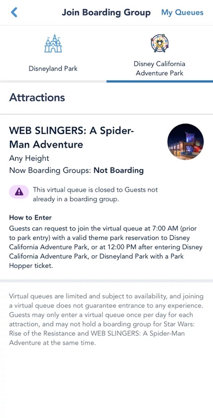
Explain Why the Queue Is Closed
A virtual queue may not be open when users attempt to enter it — perhaps because it opens at a specific time, or perhaps it filled up and is no longer accepting visitors. If the virtual queue is closed, clearly communicate that to your users. Also, explain why the queue is closed.
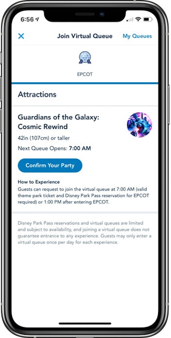
4. Explain When the Queue Opens and Allow Users to Prepare in Advance
If the queue is not yet open, ensure that users know how to access it when it does open.
If users must complete additional steps (such as entering details or completing paperwork) to enter the queue, allow them to do them before the queue opens. Any interaction with limited access that requires a queue is inherently stressful. Users will already be mentally and emotionally taxed by the uncertainty of the interaction. Plus, if the queue opens at a specific time, being on time for the opening adds more pressure. Give users the option to do any necessary tasks in advance so that, when the time comes, they do not have to do these activities under pressure.

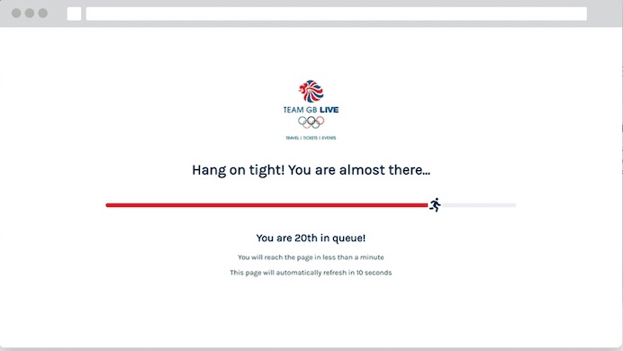
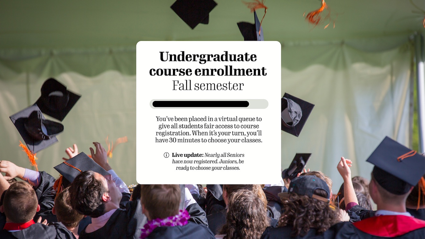
For interactions where many users may be arriving for a specific event, consider starting to manage traffic in advance of the queue opening. Ticketmaster used a waiting-room feature to hold visitors before the queue had formally opened. The benefit of a waiting room is that users do not have to refresh the page to get into the queue when it opens. Those who arrive early are put in the waiting room and randomly added to the queue when it opens.
In this case, the screen did a good job communicating that users did not have to do anything else to enter the queue. The message on the page read When the sale begins, your screen will automatically refresh and you will be moved into the Queue. The term waiting room, along with this explanation and the countdown until the queue opened, helped users understand that the queue was not yet open and why they were not advancing.

5. Explain Any Requirements Before Users Join the Queue
Will users need to have specific items (like a receipt for a return) with them? Will they need to complete paperwork in advance? Don’t wait to communicate these things until users are in the queue, or users may unfortunately need to abandon their place in line because they cannot satisfy your requirements.
While Customers Are in the Queue
6. Clearly Indicate Details of the Wait in Understandable Terms
Keeping users informed of what’s going on is a universally applicable principle of user-experience design and the first of Jakob Nielsen’s 10 heuristics for user-interface design.
Waiting in a virtual queue could last anywhere from several minutes to several hours. Such lengths of time call for more robust status messaging than the traditional progress indicators, which are suitable for wait times of a few seconds to a few minutes.
Status trackers are visualizations meant to keep users informed during longer waits. For processes that may take several days or weeks (e.g., a loan application, the shipping of a package), organizations use status trackers in conjunction with progress updates delivered via email or SMS to keep users abreast of the progress of the activity.
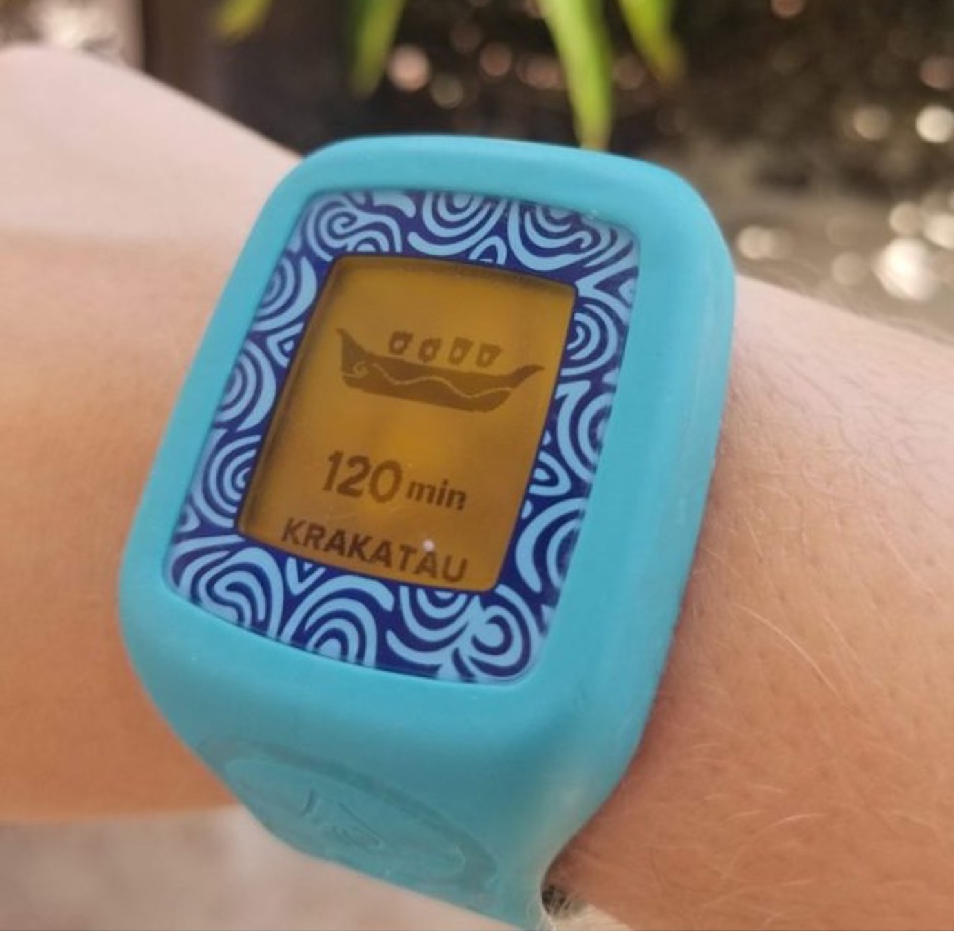
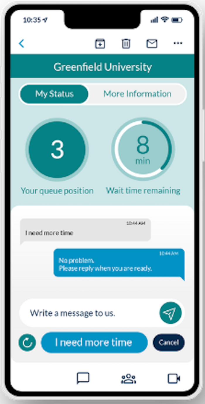
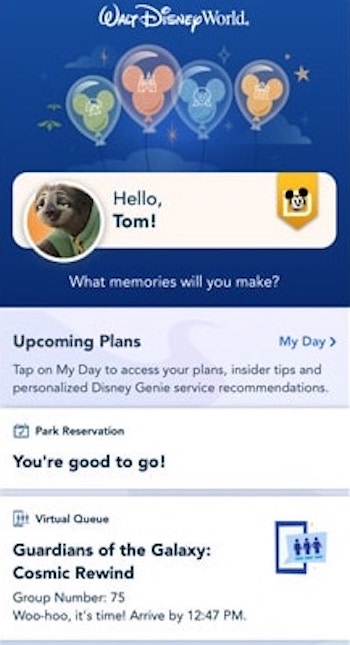
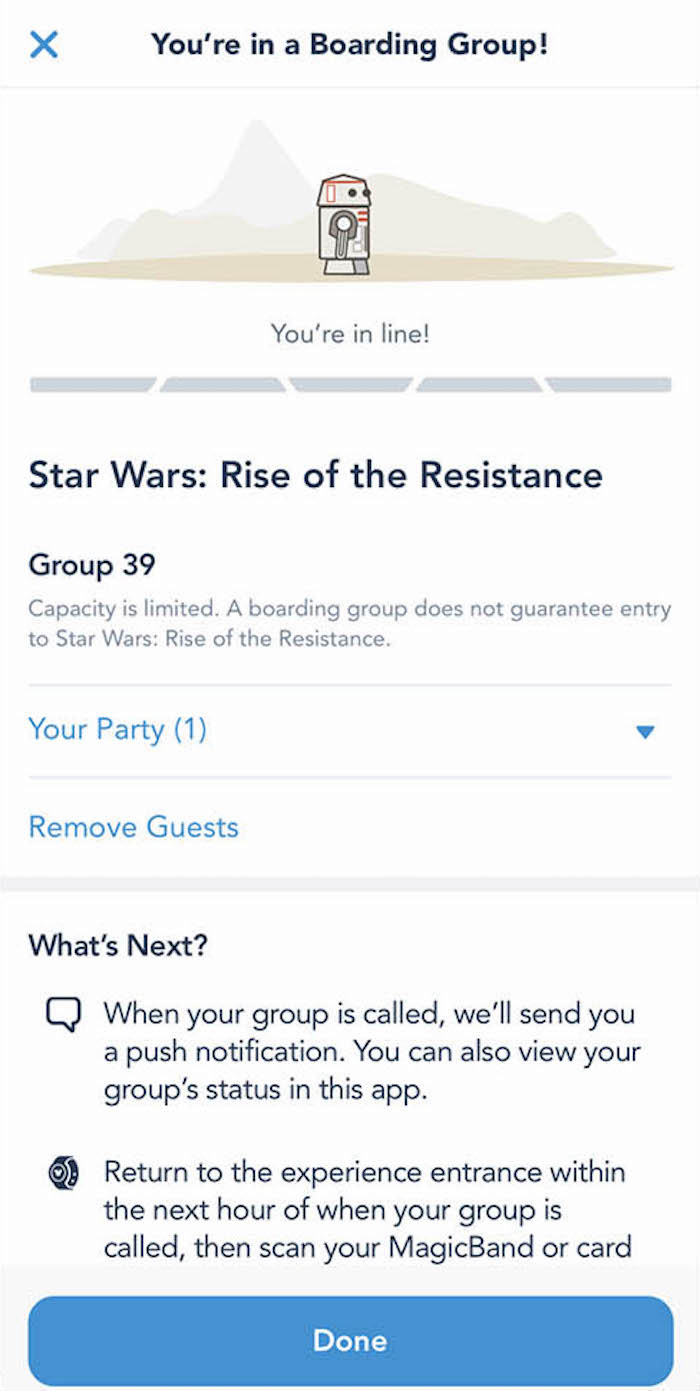
Status trackers can also be used to give users a visual indication of their place in a virtual queue, but they must be adapted to the shorter wait times associated with such queues. The tracker visualization should show detailed, low-granularity progress, not just big milestones. This is because, with queues, people will often be standing by and checking their progress, so they will require confirmation that they are still in line and the line is moving as expected. Status trackers in virtual queues should be coupled with at least one, but ideally both of the following pieces of information:
- The user’s place in the queue: How many people are in front of the user?
- Estimated time of the wait: A best estimate of how long the wait will be, in a format that your users will understand


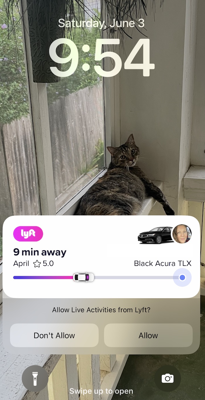
For virtual queues that take place on mobile devices, consider empowering the user with the details of their wait without requiring them to open the corresponding app. Both Android devices and iOS devices (with the release of iOS 16) can show live activities on the lock screen of the device. Apps like Uber and Lyft use this capability to show ride status on the screen while the device is locked, eliminating the need to continually check the status manually.
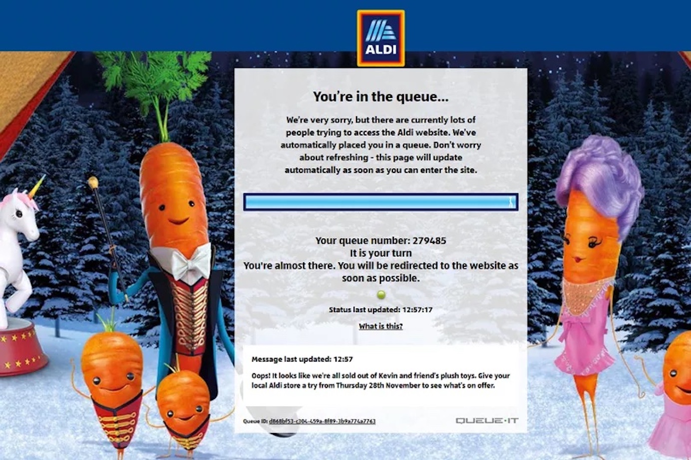
7. Refresh Queue Status Automatically
A well-designed virtual queue will not require the visitor to refresh the page to see updates about their wait time or place in line.
Some visitors may not realize that the queue is self-sufficient and, if they don’t see the page actively changing, may refresh it manually, which could risk their place in line. So, inform them that the page will update on its own and they are not required to refresh it.
Adding a timestamp indicating when the page last refreshed is even better than just letting users know that the page will refresh automatically. The timestamp would reassure users that the queue is active and working as expected.
8. Consider Allowing Visitors to Set Up Queue Notifications
Waiting on your own terms is always better than feeling tied to the device to catch your turn. Queues that allow users to leave and come back without losing their place are ideal. To this end, allow users to set up notifications so they know when their turn is near. Consider providing users with a choice of the channel where they want to receive the notifications (e.g., SMS, email, push notifications).

9. Make Clear What Happens if Users Exit the Page
Every queue may function differently, with some allowing users to leave without losing their place in line and others requiring that the page remain open. Explain whether visitors can leave without losing their place or what happens if they exit the page.


10. Make It Easy to Reaccess the Queue
If your queue design does allow users to leave and come back without losing their place, then your design must accommodate returning users. On the website or app, include an area on the homepage or landing page that is easily noticeable and allows people to reaccess the queue with one click.

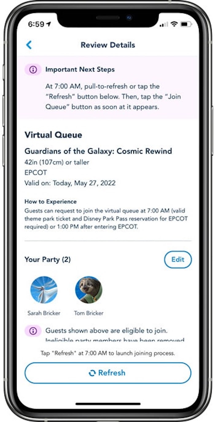
11. Prep Visitors for Their Turn in Advance
One of the most important principles for seamless omnichannel customer journeys is to always prepare users for what comes next in the journey. Waiting in a queue for a chance to interact creates natural stress due to the uncertainty involved. Designers should seek to eliminate as much uncertainty as possible so users feel prepared and at ease about what comes next when their it’s their turn in line.

If visitors may lose their turn if they don’t act quickly, it’s critical to prepare customers with such information well in advance of their turn.

12. Notify Visitors of Important Developments While They Wait
Any important changes in the status of your offering should be clearly communicated during the wait. It’s bad form to ask visitors to wait in line only to find out that the thing they were waiting for is no longer available.

13. Entertain Visitors During the Wait Only if It Doesn’t Interfere with the Primary Task
Simple interactions, such as games or media, can be a nice addition to any queue, but especially to one that requires users to stay on the page during the wait.

But such content should not add complexity, distraction, or confusion to the queue experience.
For example, in our research on the usability of children’s websites, many interactive tools and games that took a long time to load attempted to help users pass the time by showing videos or shorter games while they were waiting.
Unfortunately, in many situations, children couldn’t separate the real game from the loading screen and they would often not understand why an (interim) game stopped midway (to start the real game). To keep users interested but not distracted from the main activity, we recommend a few approaches:
- Ensure that any interim entertainment does not obscure the main progress indicator.
- Use simple and fun media that is related to the purpose of the queue, as they are most likely to hold users’ attention and reduce the perception of wait time.
- Ensure that, when it’s the user’s turn to enter the site, there is a clear and logical break between the end of the waiting experience in the queue and the beginning of their turn on the site.
Conclusion
Virtual queues don’t have to be created from scratch. There are many out-of-the-box tools that can be used to manage virtual queues. Many of these tools can be seamlessly integrated within your larger website or app.
If your online or offline experience could benefit from a virtual queue, consider in advance how that queue should be implemented. Use these best practices as a guide for planning the features and functionality needed for your specific context. With these initial requirements in mind, vet possible queue-management solutions to ensure they’re able to meet the design requirements needed for your queuing system.
However, even when using an established tech solution, testing and iteration should not be omitted. Test your queueing system with real users to discover blind spots and gather feedback to optimize the design.