Before you use a checkbox on your interface, you got to ask yourself a couple of questions. Is a checkbox the right component to use in this context? If it is, what’s the most usable way to display them?
Many designers fail to ask these questions and automatically use checkboxes without much forethought. As a result, they create usability issues by using them in the wrong context.
Not only that, but many designers are lazy and expect native checkboxes to do the job instead of a custom checkbox design. But the problem is that native checkboxes don’t do the job because they have poor usability.
There are ten usability mistakes most designers make on checkboxes that undermine the user experience. It’s time to stop making these mistakes and start using checkboxes correctly.
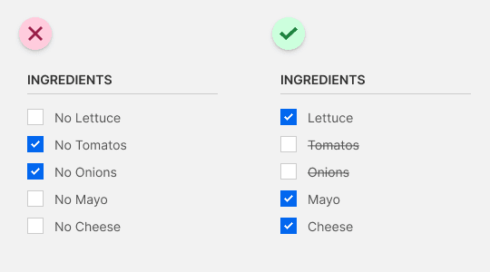
1: “No” labels are a no-no
Checkmarks universally signify affirmation, not negation. Checkbox labels that include “no” force users to affirm a negative, breaking their mental model of checkmarks. To emphasize item removal, check all the items by default and allow users to uncheck the ones they don’t want. Apply a strikethrough over the unchecked labels as an extra visual cue for negation.
2: Duplicate items demand double duty
Sometimes you may want to offer an item in different quantities. Duplicating it with multiple checkboxes produces more text to read and clutters the interface. For incremental input changes, display the item once with a number picker.

3: A bigger target as a check token of gratitude
It’s no secret that checkboxes are hard to click due to their small hit target. Designers will often make the label clickable, but that doesn’t help if it isn’t intuitive. You can give users a bigger hit target and clearer interaction cue by converting your checkboxes into check tokens.
4: Faster to scan than a laundry list of items.
Contrary to popular belief, a vertical list of items is slower to scan than a horizontal list because it requires more saccades (research study). Instead of stacking checkboxes into a laundry list, try wrapping check tokens for a shorter list and faster scan.

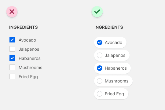
5: No checkmarks when the feeling isn’t mutual
Sometimes items are mutually exclusive, meaning users can only select one out of the set. Using radio buttons are okay but can still confuse some because not all users know the difference. A better solution is to use tokens minus the checkmark. Removing the checkmark removes the idea of multiple selections.

Subscribe to access the full article
Read the full article to learn all ten usability mistakes and the solutions to them that most designers aren’t aware of. You’ll also get a beautiful booklet of the examples in this checkbox series to remind you of these best practices.
Book

Affiliate

You are right in most of your examples, but there are some things that might be not 100% accurate.
For example the study you have provided for vertical vs horizontal lists is kind of old for today standards. Also on mobile screens the vertical lists are more user friendly than horizontal. This is more applicable for to-do list apps like Keep Notes from Google. Even in “real life”, when you are writing on a piece of paper a list of things to buy, you are writing them vertically 🙂
Keep up the good work! …but is kind of sad that you are requesting so much money for the complete article.
An “old study” doesn’t necessarily invalidate its conclusion. Many studies and discoveries of the past still hold true today, so discrediting it because it’s “old” is a weak argument.
When you write lists horizontally you have to move your hand laterally, which requires more effort. Writing them vertically allows you to keep your hand in the same position so people prefer this. Writing a list is completely different from scanning it.
Investing a few dollars per month is essential for anyone who’s serious about improving their professional career. Our premium subscription is worth every penny.
When I’m scanning the vertical list though I dont have to read the whole word to know whether it is something I want. Usually I can pick up what it is based on the context and the first couple of letters.
However, scanning the horizontal list requires me to read the whole word to find the end of it and where the next word starts.
Good content though!
Hello Anthony,
I am a UX/UI designer from Moscow. I really like your article. May I translate the article into Russian to help more people learn from it? Hoping to get your authorization.
Hi Anthony, I am currently writing an essay for my university assignment and would love to use an article of yours to reference in my text however I can’t seem to find your last name. One of your articles proves a valid point that will ensure me a good grade so if it is okay with you it would really help to get your last name so I can reference you in my essay.
Thanks
The study is about square like shapes organized on a grid. Not words with random shapes, and no grid. Here is a study about visual search of word lists. I hope you find it useful.
https://www.sciencedirect.com/science/article/pii/S0042698902000779