A new year brings new interior design trends! Let’s take a look at the paint colors of the year for 2022, and see what they can tell us about home decorating trends in the new year.
Every year, leading paint manufacturers announce their paint colors of the year. They select colors, based on input from color experts and designers, that will represent the upcoming year’s trends. It’s a great way to see which colors will be hot in the design world, and can give you some fresh new ideas for painting your home. This year, you’re going to see a clear theme…
Benjamin Moore Color of the Year 2022
Benjamin Moore has chosen October Mist (1495) for their color of the year, which is a beautiful silver-green hue. The color green symbolizes balance, growth, renewal, and relaxation, which is something I suppose we could all use in 2022. October Mist is a soft, dusty, sage green that sits in the yellow-green family. It’s perfect in spaces that you want to feel relaxing and peaceful, like bedrooms, living rooms, or your home office. Get a peel-and-stick sample sheet of October Mist HERE.
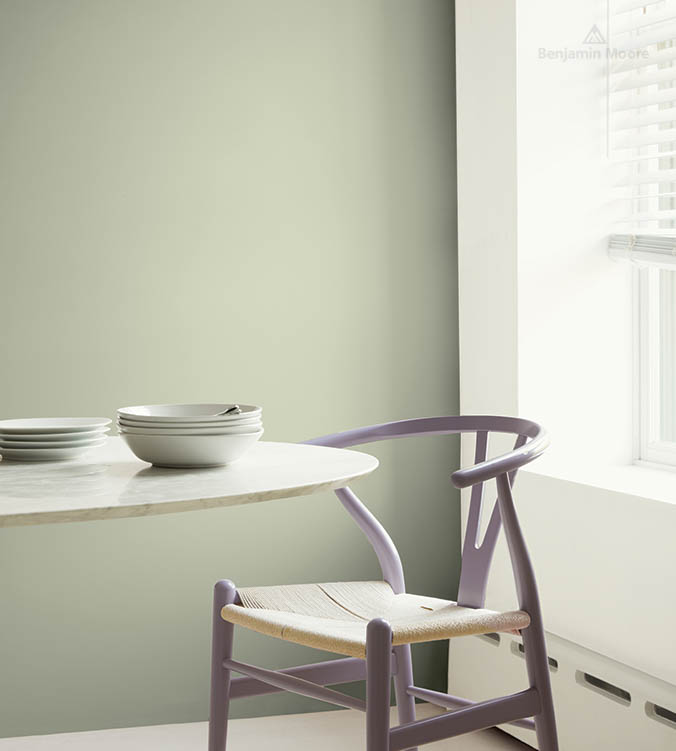
Source: Benjamin Moore
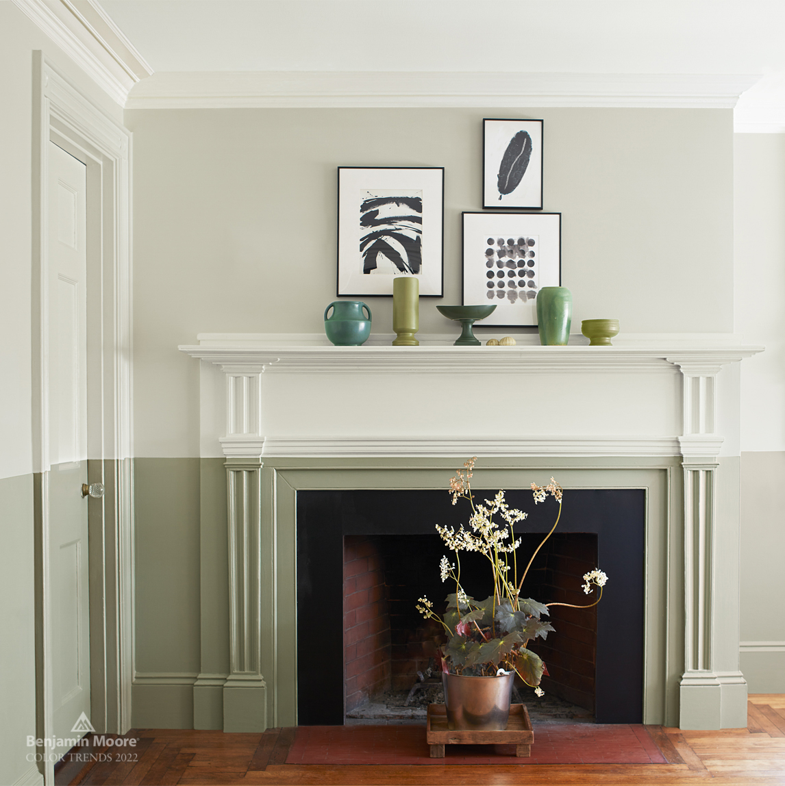
Source: Benjamin Moore
Does it feel like you’re always choosing the wrong paint colors for your home?
Join my FREE masterclass on Mistakes to Avoid When Choosing Paint Colors:
- Learn the 3 biggest mistakes people make when choosing paint colors
- Discover the ONE thing you must do before committing to a color
- Feel more confident knowing which colors will work best in your space

Sherwin Williams Color of the Year 2022
There’s no doubt that gray-greens are going to be huge in 2022. Sherwin-Williams also chose a designer-favorite green for their color of the year…Evergreen Fog (9130). This is another green hue that lies in the yellow-green family, but it’s darker than BM October Mist, and has more gray to it. Evergreen Fog looks absolutely amazing paired with wood, leather, brass, and copper accents. Use it in your office, your living room, or even on your cabinetry.
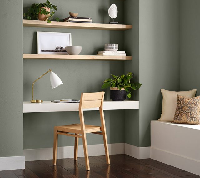
Source: Sherwin-Williams
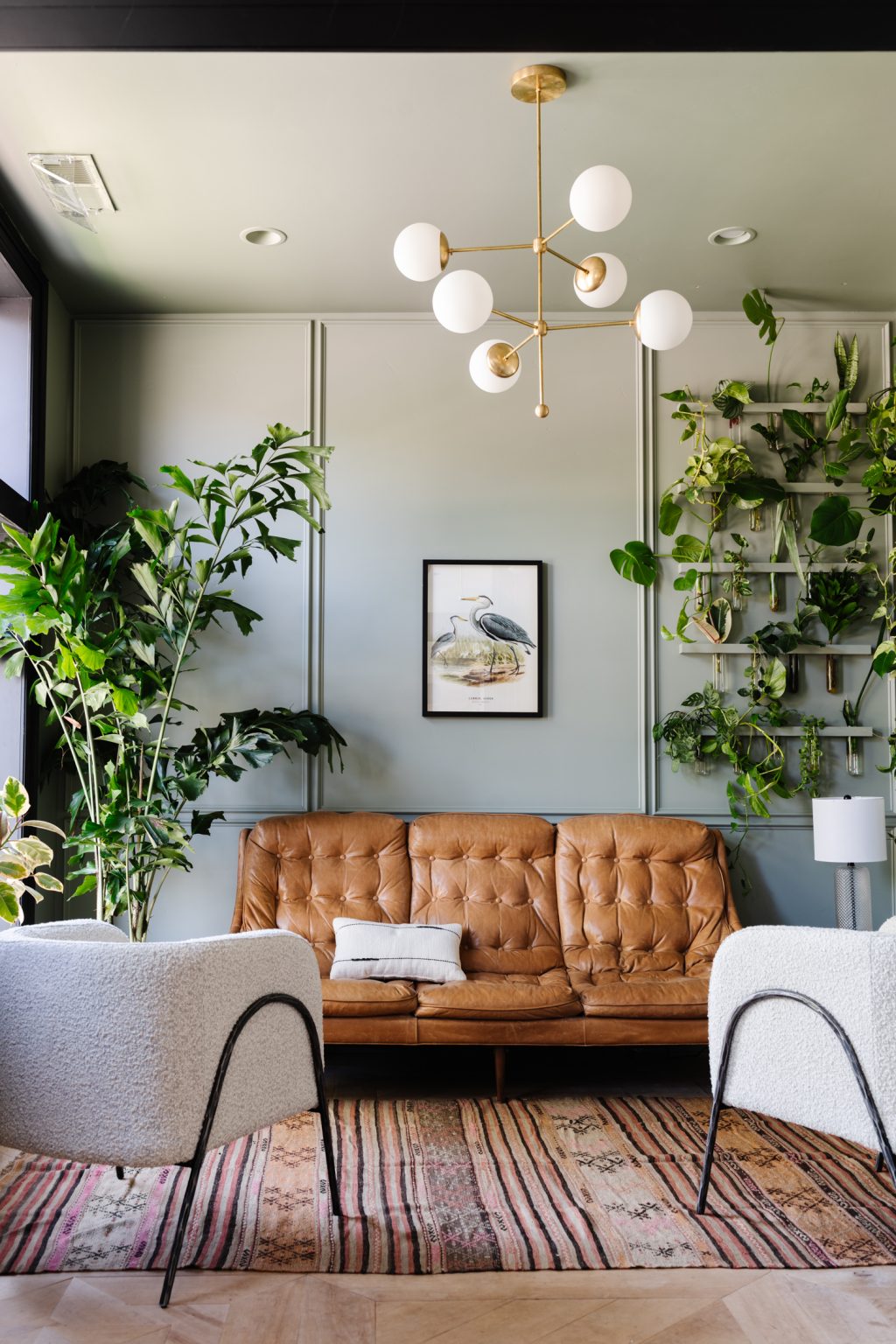
Source: Vintage Revivals
Check out this beautiful kitchen from Kindred Interiors, with Evergreen Fog on the cabinets. If you need more ideas for kitchen cabinet paint colors (that aren’t white), check out this post. Get your peel-and-stick sample sheet of Evergreen Fog HERE.
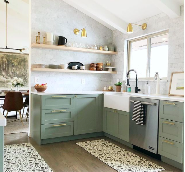
Source: Kindred Interiors via Instagram (@kindredinteriors)
PPG Color of the Year 2022
If I told you that PPG also chose a green for their color of the year for 2022, would you be surprised? The PPG paint color of the year is…Olive Sprig (PPG1125-4). This green is a little more vibrant and saturated than the greens from Benjamin Moore and Sherwin-Williams, but not overly so. It is also in the yellow-green family, and could be a great paint color to brighten up your space, while creating a relaxed, organic feeling. Get a peel-and-stick sample sheet of Olive Sprig HERE.
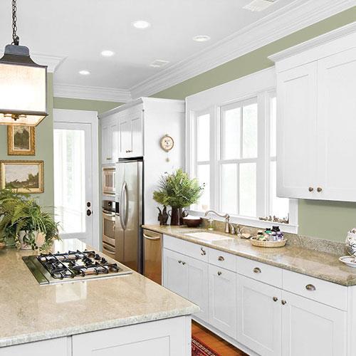
Source: PPG
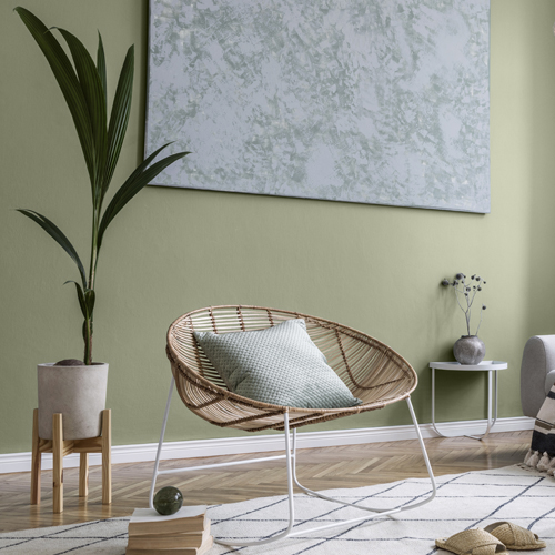
Source: PPG
Behr Color of the Year 2022
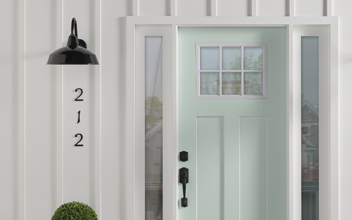
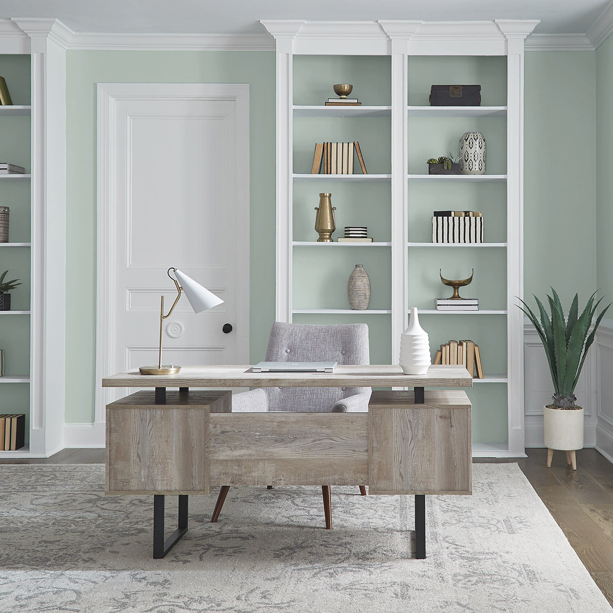
Behr’a paint color of the year for 2022 is Breezeway, a tranquil, light, sea-glass green. It’s a happy hue, that evokes a sense of moving forward. You can use Breezeway anywhere in the house, from your bedroom, to your cabinetry, and even on your front door. Some great colors to pair this silvery-green are creamy whites, taupes, charcoals, and even terracottas. Breezeway is very similar to the ever popular Sea Salt from Sherwin-Williams, which is a tad more muted, and (I think) has slightly better coloring.
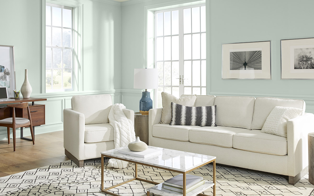
Source: Behr
Source: Behr
Source: Behr
Farrow & Ball Colors of the Year 2022
Farrow & Ball chose five shades that they claim will define 2022. They include: Babouche, School House White, Breakfast Room Green, Stone Blue, and Incarnadine. There’s quite a range here, so let’s have a look at each one.
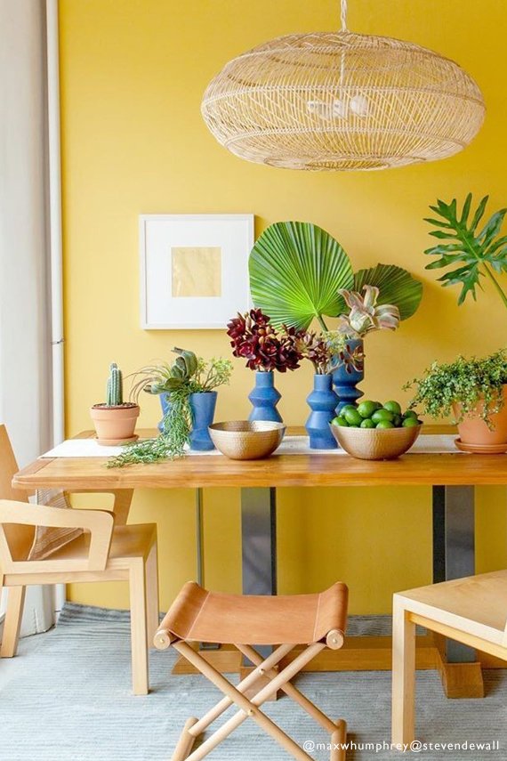
1. Babouche No.223
This is a bright and cheerful shade of yellow, named after the distinctive color of the leather slippers worn by men in Morocco. It’s bold, but not obnoxious, and can be a great color for an accent wall. Get your peel-and-stick sample sheet of Babouche HERE.
Source: Farrow & Ball
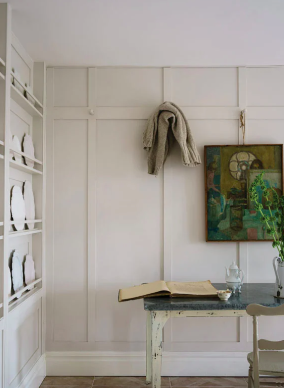
2. School House White No.291
School House White is a soft off-white that is described as being “understated and comfortable to live with.” It’s a warm white, but has very muted undertones, and can feel like a familiar, vintage paint color from long ago. Get your peel-and-stick sample sheet of School House White HERE.
Source: Farrow & Ball
3. Breakfast Room Green No.81
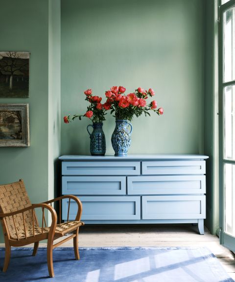
Another green! But this one is much more lively than the other green paint colors in this post. It’s a versatile color that can make a statement all on its own, or be paired with other shades for a unique look. Farrow & Ball recommends pairing Breakfast Room Green with School House White for a fun, retro vibe. This green is quite neutral, so it looks equally great with yellows as it does with blues, and it can create a striking contrast with red (its opposite on the color wheel). Shop for a sample sheet of Breakfast Room Green HERE.
Source: Farrow & Ball
4. Stone Blue No.86
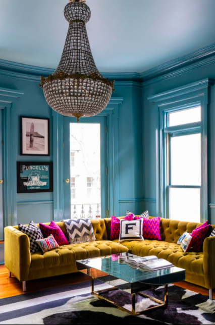
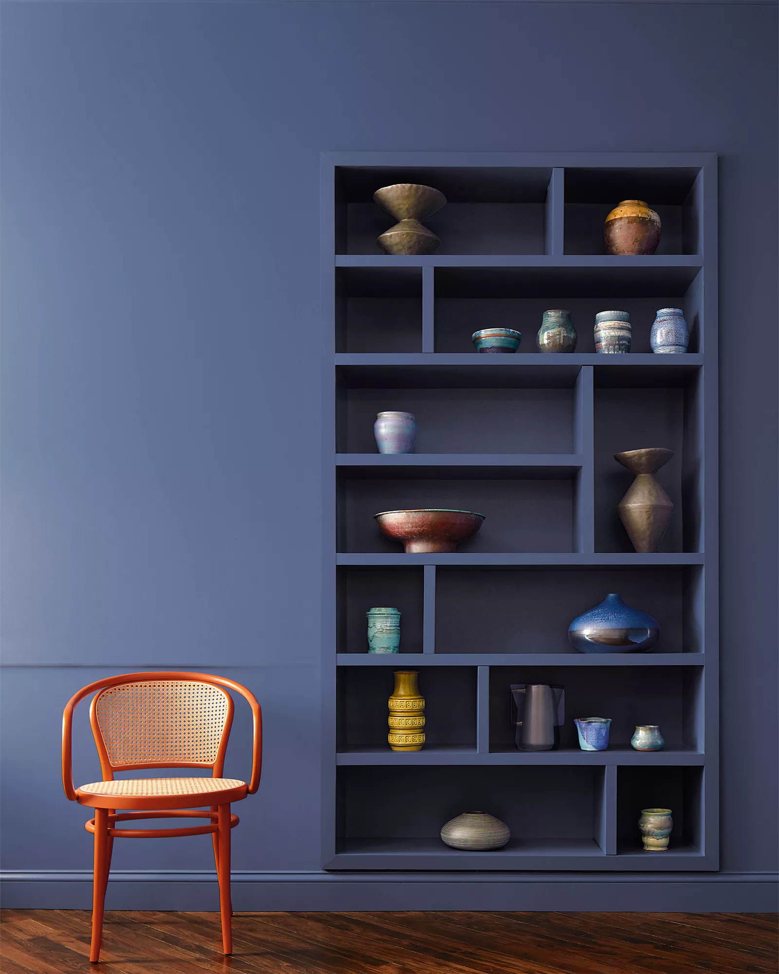
Stone Blue is a vibrant and timeless blue. You can use it on its own throughout a space for a dramatic look, or use it sparingly on accent walls or doors. Pair it with other lively colors for a bold statement or tone it down with a calming off-white…the choice is yours. Shop for a sample sheet of Stone Blue HERE.
Source: Farrow & Ball
5. Incarnadine No.248
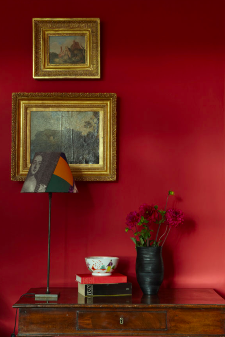
If you’re looking for a rich, crimson red, take a look at F&B’s Incarnadine. It’s a classic, bold red that can lean glamorous, when paired with rich woods and golds, or edgy, when used with crisp white and black. Get a peel-and-stick sample sheet of Incarnadine HERE.
Source: Farrow & Ball
Now that you’ve seen the paint colors of the year for 2022, what do you think of them? Are you surprised to see so many greens?
My 2022 Color Predictions
- We saw the emergence of gray-greens in 2021, and they remain very popular here at the start of 2022, so that is a legitimate and very strong trend. I predict that we’ll continue to see a lot of muted greens used in bedrooms and offices, as well as for accent walls and kitchen cabinets.
- Other light neutrals, like off-whites and light greiges are going to still be hugely popular for walls, as well.
- Cool grays are rapidly going out of style, in favor of lighter shades with warmer undertones.
- I think we’ll see the emergence of more color used in designer rooms, especially dark, rich colors being used on every surface (walls and trim)
I guess we’ll just have to wait until the end of 2022 to see how my predictions pan out. In the meantime, happy painting!
If you want to see any of these colors applied to your walls, before you commit to painting, check out my Interior Paint Consultation.
This post contains affiliate links to Samplize. If you click a link and make a purchase, I may receive a small commission at no cost to you.

Leave A Comment