
At times, users will encounter empty states within an application: containers, screens, or panels for which content does not yet exist or otherwise cannot be displayed.
Especially in complex applications that have not been fully configured by the user, empty states are quite common during onboarding and initial usage. Some typical scenarios when users might encounter empty states within an application are:
- When a user has not designated any items as favorites or has not opened any files yet, containers meant to display lists of favorited or recently viewed items will be empty.
- When an application supports alerts, but a user has not yet configured any alerts, there may be an empty pane or dialogue where those alerts will eventually appear.
- When an application is composed of various workspaces or dashboards, but a user has not added content to those areas, those pages or screens will be empty.
- Search results lists when nothing is found, as well as other cases where a command creates empty output.
The default of an empty space is to simply remain empty: Display no content to the user until the space has been configured or personalized. While this approach may save development time (or even be an intentional decision during an early beta design of a product where other features must be initially prioritized), it ultimately creates confusion and decreases user confidence — and misses a goldmine of opportunities for increasing the usability and the learnability of the application, as well as the discoverability of key features.
Empty states that are intentionally designed — not left as an afterthought — can be used to:
- Communicate system status to the user
- Help users discover unused features and increase learnability of the application
- Provide direct pathways for getting started with key tasks
Use Empty States to Communicate System Status
Totally empty states cause confusion about how and whether the system is working. When users encounter an empty panel or screen in an interface after attempting to filter, query or display specific content, they’re likely left wondering a myriad of questions: Is the system finished processing the request? Is content still loading? Did an error occur? Did I set the wrong filters or parameters?
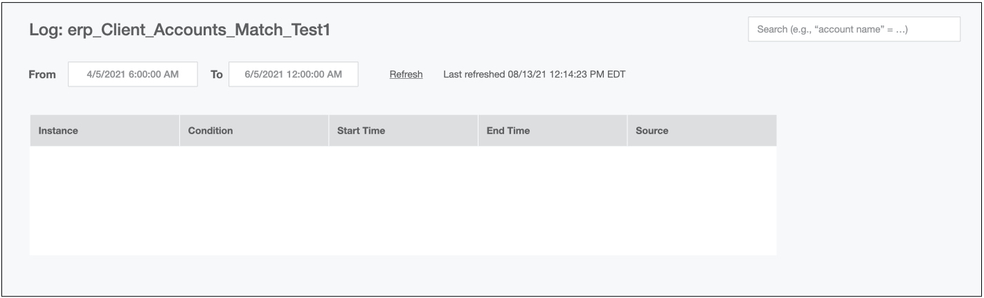
As an example, consider the dialogue for displaying log details below. When a user specifies and applies a date range for which there are no logs, the table in the dialogue — logically — does not display any log details. However, because there is no system feedback provided, the user cannot know whether there truly are no details to display, whether an error has occurred, or whether the system is still processing the request. Users are likely to waste time refreshing the query several times before feeling confident enough to move on.
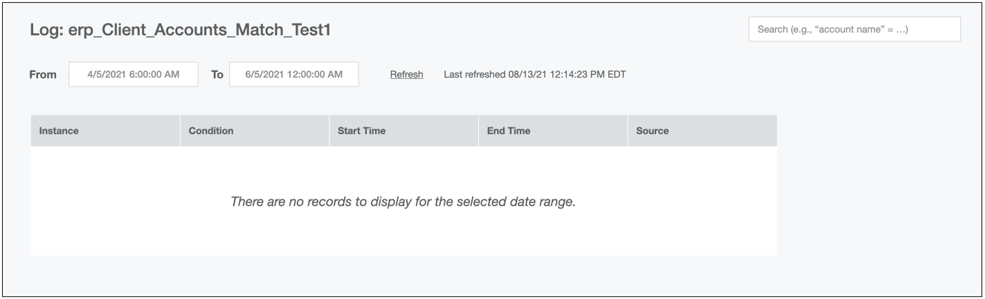
A brief system message within the content area at completion of the process (e.g., “There are no records to display for the selected date range”) would be a simple yet effective way to increase the visibility of system status and, therefore, user confidence in the results.
A worse, yet equally common scenario, especially in applications with high information density and lengthy processing times, is when the system defaults to a misleading system-status message: declaring that there are no items to display, only to replace it with content after the process is completed.
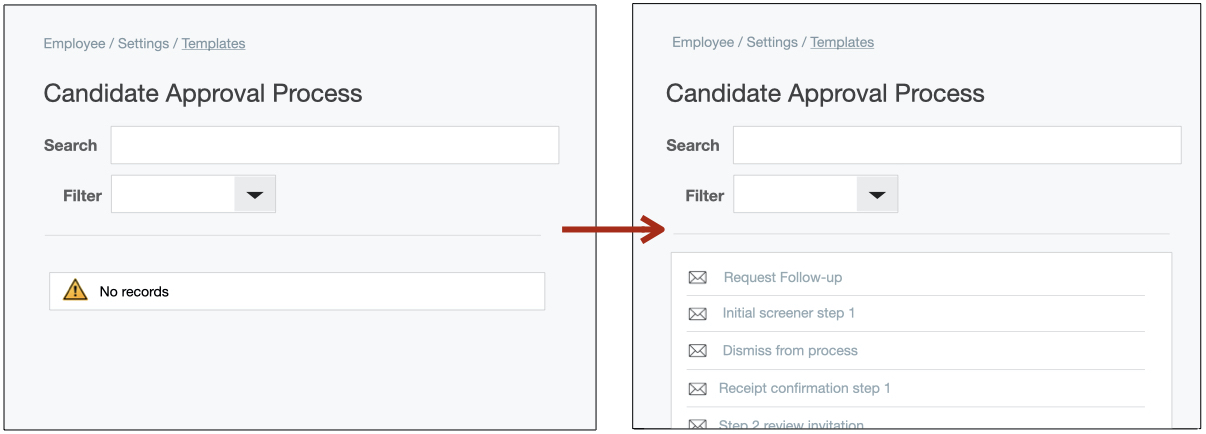
For example, when loading content in the employee-management software below, users encounter an empty-state container with the system-status message No records. This information would be highly useful if, in fact, there were no records. However, after a few seconds of waiting, the system replaces the inaccurate system-status message with the requested items.
Inaccurate system-status messages for empty states are particularly harmful. In the best-case scenario, users wait out the process and discover the relevant content but develop a severe distrust of and distaste for the application. In the worst-case scenario, trigger-happy users (that is, most users) never see the relevant content and cannot complete their work.
Use Empty States to Provide Learning Cues
In-context learning cues displayed when the user has started a task help users understand how to use an application or system in real time, as they explore the system. In most cases, this approach is generally more successful than forced tutorials shown to the user at initial use. That’s because in-context help can often be applied right away and is thus more memorable — users have little time to establish associations between lengthy onboarding content and the actual interface.
Empty states present an opportunity to provide contextual help relevant to the user’s task. These help messages are sometimes called pull revelations because they show up only when the user interacts with the corresponding UI element and they are not “pushed” in any obtrusive or interruptive way.
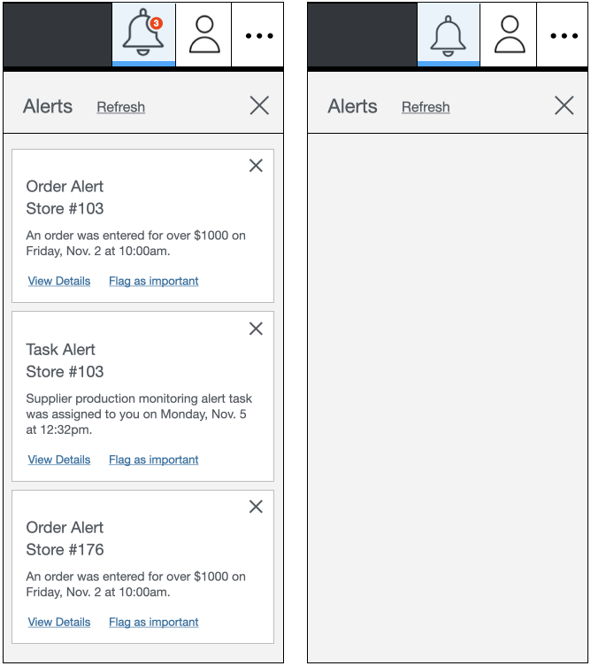
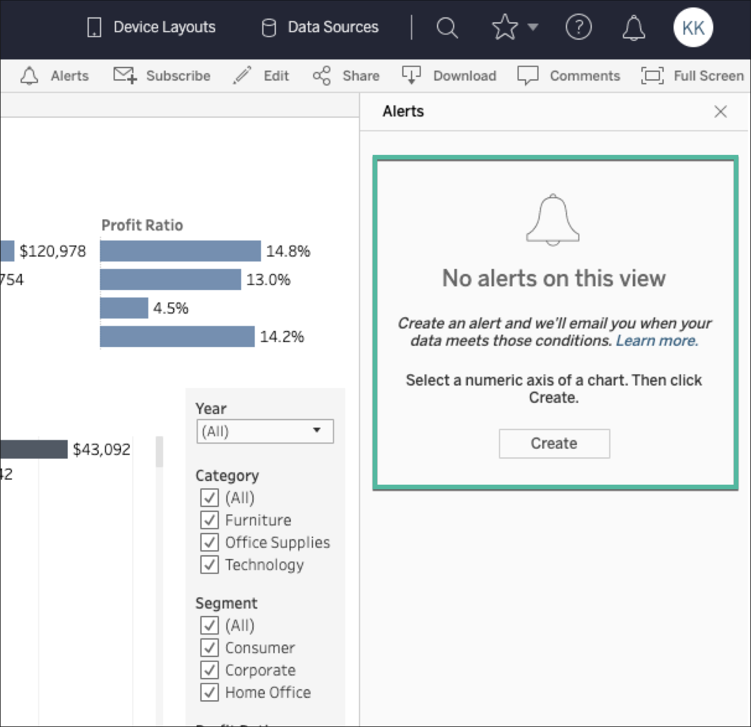
For example, consider the Alerts panel below from an enterprise resource-planning (ERP) application. When the Alerts panel is populated with alerts, it is fairly obvious how one might engage with the content. (This state of the panel is probably how this element was mocked up and tested.) However, when the Alerts panel is empty, it presents the issues previously discussed: Users may wonder whether an error has occurred or whether they have accurately created parameters necessary to trigger alerts. (As in the earlier example, a brief system-status message stating that there are no alerts would be useful here.)
Furthermore, though, this totally empty state of the Alerts panel misses an opportunity to educate the user about the alerts function. A brief dialogue could provide information about what alerts are and how to get started using them.
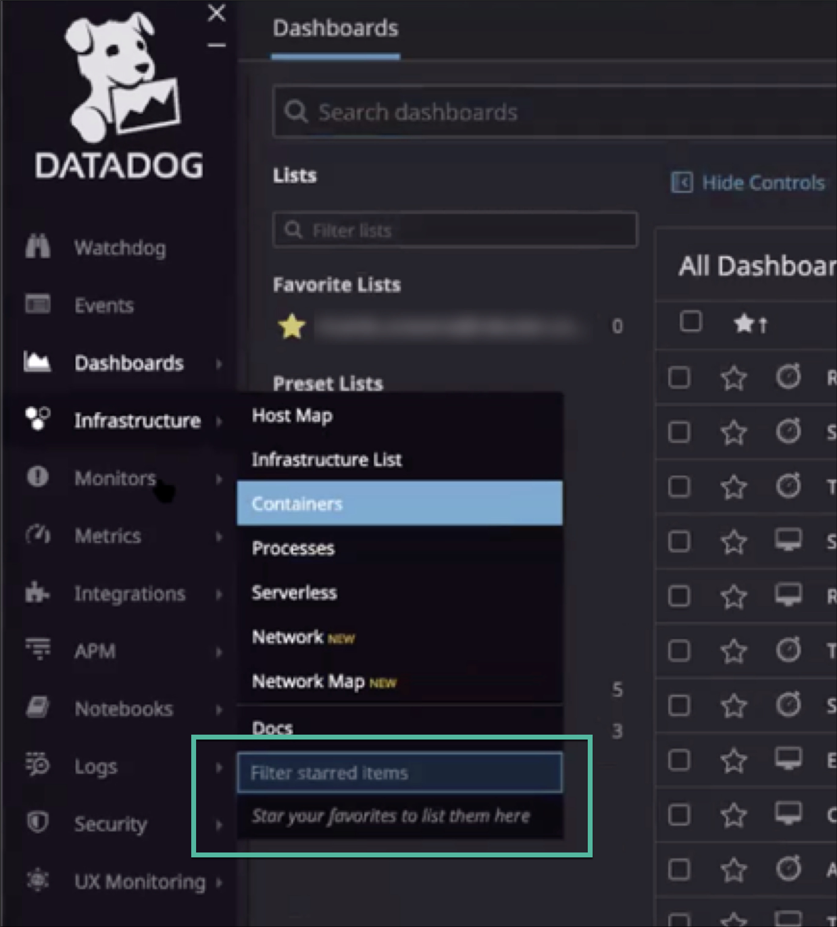
In contrast, DataDog, a data-monitoring application, makes use of contextual help content within the empty state. When the user has not starred any items to create a list of favorites, the would-be content area displays the message Star your favorites to list them here.
In a similar example, when no items have been recently viewed in Microsoft Power BI, the empty-state screen contains a brief system message describing how content is added there.
Use Empty States to Provide Direct Pathways for Key Tasks
In addition to alerting users of system status and increasing system learnability with pull revelations, empty states can also be used to provide direct pathways for getting users started with key tasks or completing steps related to their current workflow.
For example, in one application-development software, the following system-status message No Records; Send a request to view details in the workspace was encountered in an empty state when no records were able to be displayed during a task. While this message does provide contextual information about what the user could do to view these records (i.e., it says to Send a request to view details in the workspace), it doesn’t tell the user how to accomplish that task, or where to go in the system to find the necessary functionality.
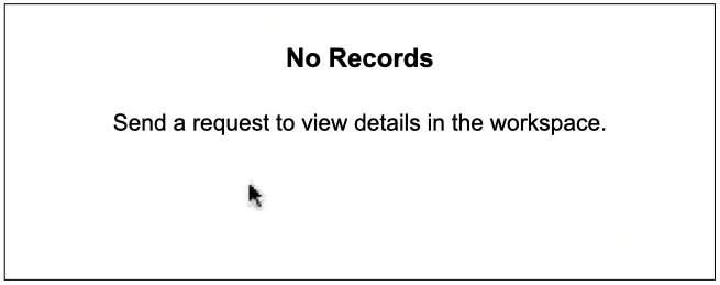
A better approach is to provide brief yet explicit instructions or, better yet, link directly to the steps that need to be taken to complete tasks associated with populating the empty state. (Here, the text Send a request might directly link to a message center or launch a message dialogue.)
For example, the application below provides a direct link within the empty state — a button labeled Create which allows users to create alerts. For users who may need more information to understand why alerts are useful and how to use them, a Learn more link item also leads directly to associated documentation.
This type of empty-state design has useful implications for users getting started with complex application features, as well. For example, when users have yet to add log data to their accounts within Loggly, a cloud-based log-management application, the empty state contains 2 direct pathways into the workflow: adding external log sources or populating demo data into the application to use for safe exploration.
Conclusion
Don’t let empty-state design be an afterthought within your application. Intentionally designed empty states can help increase user confidence, improve system learnability, and help users get started with key tasks.
To summarize a few main points:
- Do not default to totally empty states. This approach creates confusion for users, who may be left wondering if the system is still loading information or if errors have occurred.
- When content does not yet exist for a screen, page, or panel, use the empty state to provide help cues. Tell the user what could be displayed, and how to populate the area with that content.
- Provide direct pathways (i.e., links) to getting started with key tasks related to populating the empty state.
- When a process is running, use progress indicators to increase visibility of system status.
- If there is no relevant data to display after a process has completed, use the empty space to provide a system-status message in the empty space that briefly states that no content is available.


